ShopDreamUp AI ArtDreamUp
Deviation Actions


Suggested Deviants


Suggested Collections


You Might Like…


Featured in Groups

Description
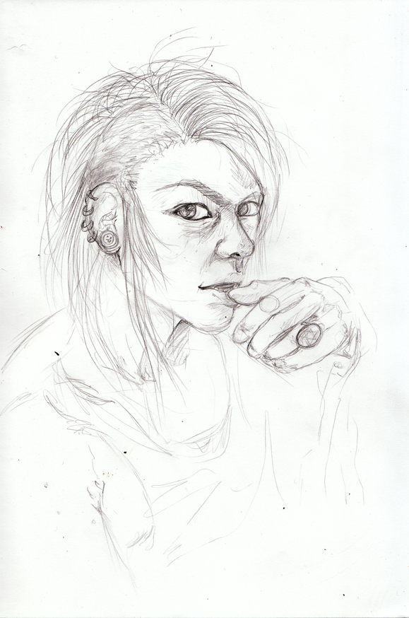
EDIT: INCLUDED REFERENCE, it was late and I was tired and completely forgot to do it >_<
a sketch i did up tonight, i'll hopefully try another go at realism portraits sometime with it. i thought i'd just upload it to see if anyone can give me any pointers/redlines/crits etc before i try colouring
I think his forehead is too wide, chin and jaw too thin, and that hair is a disaster zone. The hand and mouth gave me ages of trouble, and i'm still not really satisfied with them. The eyes are also a bit wonky i think, too large perhaps? That one eyebrow is trying to form a monobrow.... yeah plenty of things wrong here XD Let me know your thoughts!
the reference I used is here [link]
![[link]](https://www.deviantart.com/users/outgoing?http://www.google.com/imgres?hl=en&biw=1454&bih=735&tbm=isch&tbnid=7ux3Lr9s0ij1hM:&imgrefurl=http://www.officiallyjd.com/archives/102524/20120127_honmyou_35/&docid=4IWgqFs16RXzDM&imgurl=http://www.officiallyjd.com/wp-content/uploads/2012/01/20120127_honmyou_35.jpg&w=500&h=707&ei=n_LeT9bxLcPOhAff8Z2TCg&zoom=1&iact=hc&vpx=618&vpy=349&dur=437&hovh=167&hovw=130&tx=138&ty=175&sig=109695137397663014177&page=2&tbnh=167&tbnw=130&start=22&ndsp=32&ved=1t:429,r:11,s:22,i:245)
Image size
579x874px 393.56 KB
© 2012 - 2024 Amadoodles
Comments45
Join the community to add your comment. Already a deviant? Log In
OK, this is my first time critique-ing, so here goes! <img src="e.deviantart.net/emoticons/s/s…" width="15" height="15" alt="
I wouldn't worry about the hair so much for now.
General head shape: is good, I don't think the forehead is too wide, though the jaw line needs to come down a bit more than what it is currently.
Ear: Good amount of detail in here, though this needs to come down the head a bit, the ear tends to line up with the eye & mouth, not the eyebrown and nose.
Eyebrows: Could do with coming down a fraction, and to not overlap onto the nose so much, though this is an easy mistake to make with this pose.
Eyes: Look good, I like the intensity of them! The eye that's further away needs to be slightly smaller to give the drawing a greater sense of depth.
Nose: No complaints here.
Mouth: Again, no complaints, I like how the teeth are just peeking through the open lips.
Neck: this is making the head look like it's jutting out a bit, maybe make the line under the chin a bit more vertical? Though not going straight down!
Hand: I get what you mean about the hand, and I'm struggling to put a finger on why it looks odd, I think the overall size of the hand is a little big, and the first part of each finger that leads on from the knuckles could do with being a bit shorter. I always find hands difficult to draw and usually have to get someone to model for me, even photographs don't work very well!
Overll, it's an excellent effort, the shading stops it from looking 2-dimensional too, keep up the good work!